Please, Starbucks, stop talking. Stop—shhh, don’t say anything else.
Gawd, you’re hard to have a relationship with.
On the one hand, you’re gorgeous. Everything in your store looks terrific: all the package design, every store display, refrigerator cases and baskets filled with well-chosen brands with equally beautiful packaging—bravissimo. Whoever established your graphic standards knew what they were doing. And then, whoever creative-directs your materials has the boldness and confidence to frequently allow highly talented designers to make deviations from your brand standards, like jazz musicians taking liberties with the melodies of familiar songs. Just brilliant. I look forward to each season’s store-design changeover, regretting the passing of the old but looking forward to the new. I feel elevated as a person by being in the presence, regularly, of such well-executed corporate design.
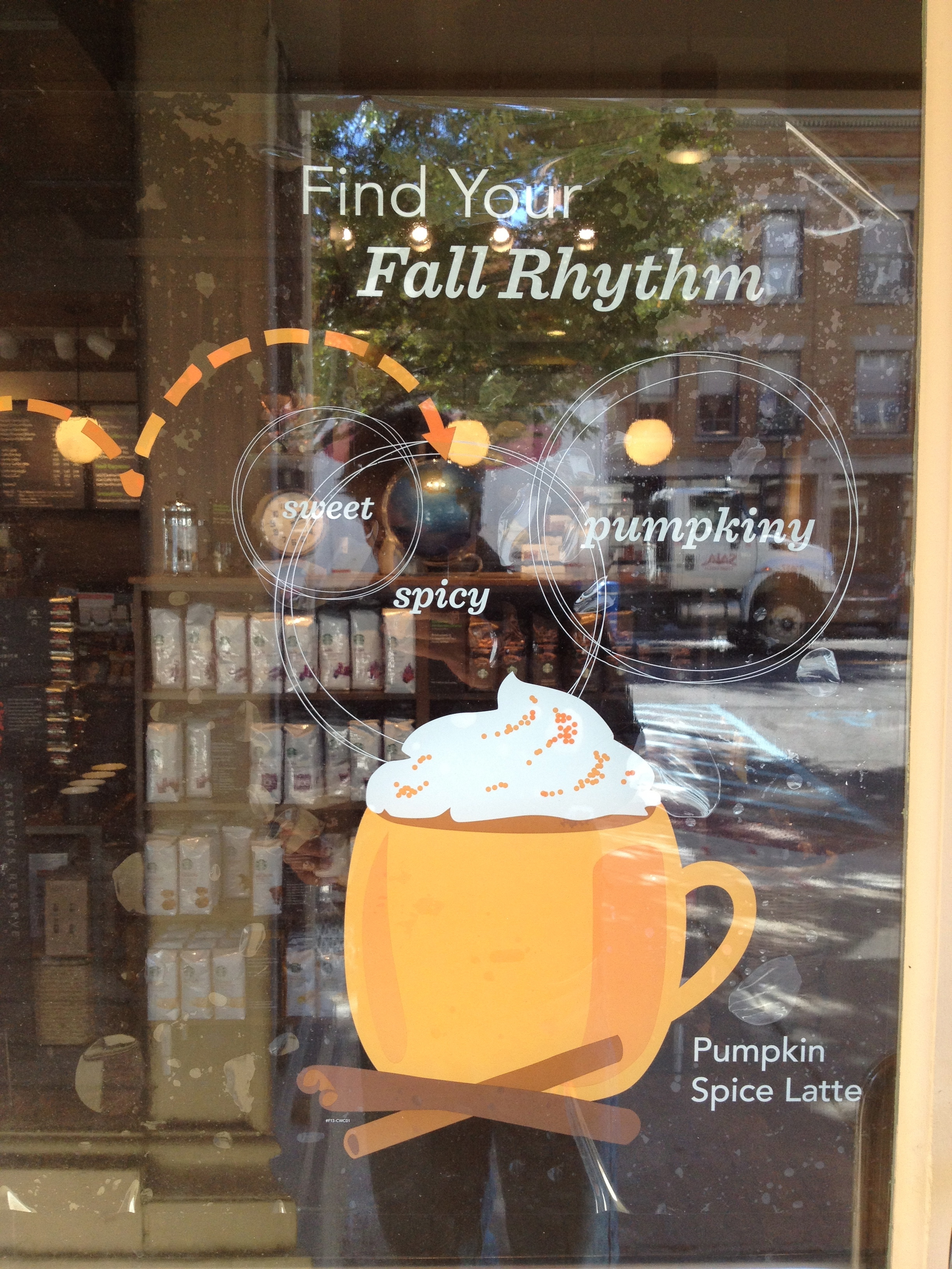
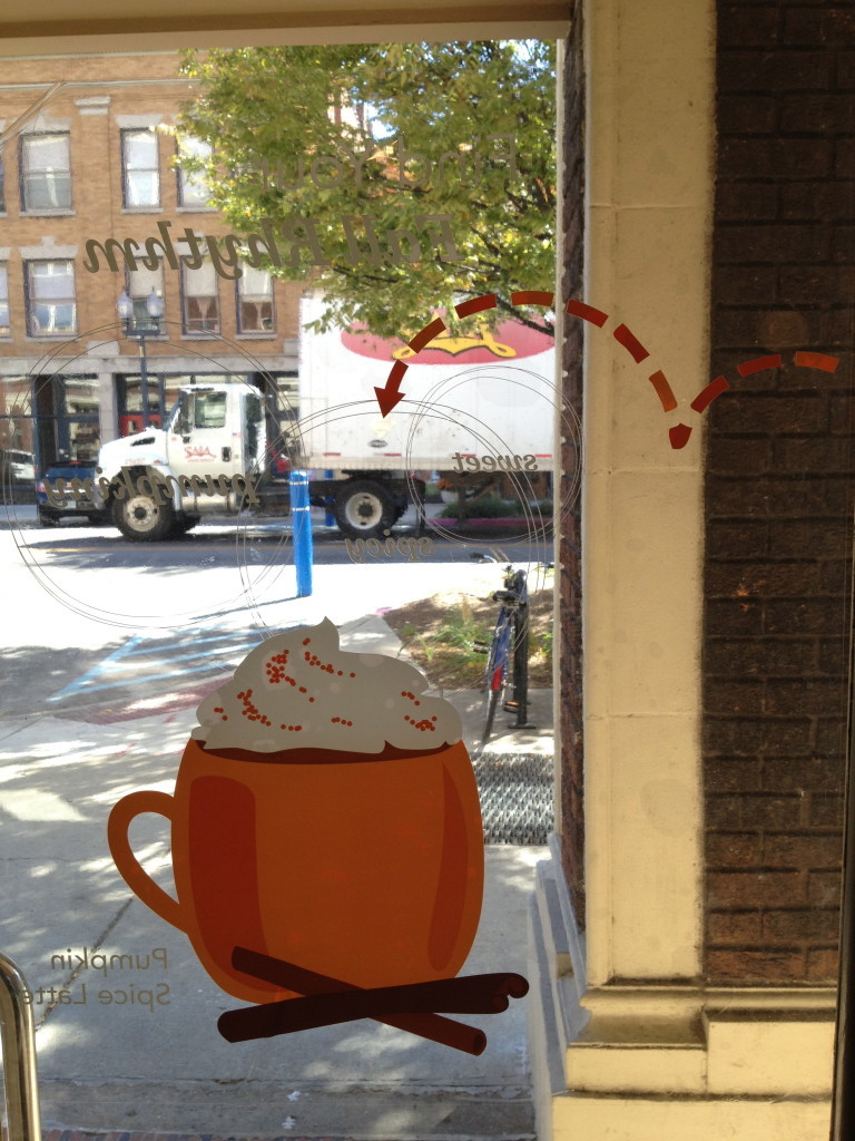
Isn’t that nice? Or the following, the door cling for fall a year or two ago—fun, modern like a vintage Brubeck album cover, and visually interesting from either side of the door: thought through, like good design always is.
Your design team is beyond reproach.
But then you start talking. And I don’t know how to tell you this, but you drive me insay-ay-ane. INSANE. The stuff you say.
What? I mean, it’s cloying. You know what cloying means, right? Here’s the Dictionary.com definition: “1. causing or tending to cause disgust or aversion through excess: a perfume of cloying sweetness. 2. overly ingratiating or sentimental.”
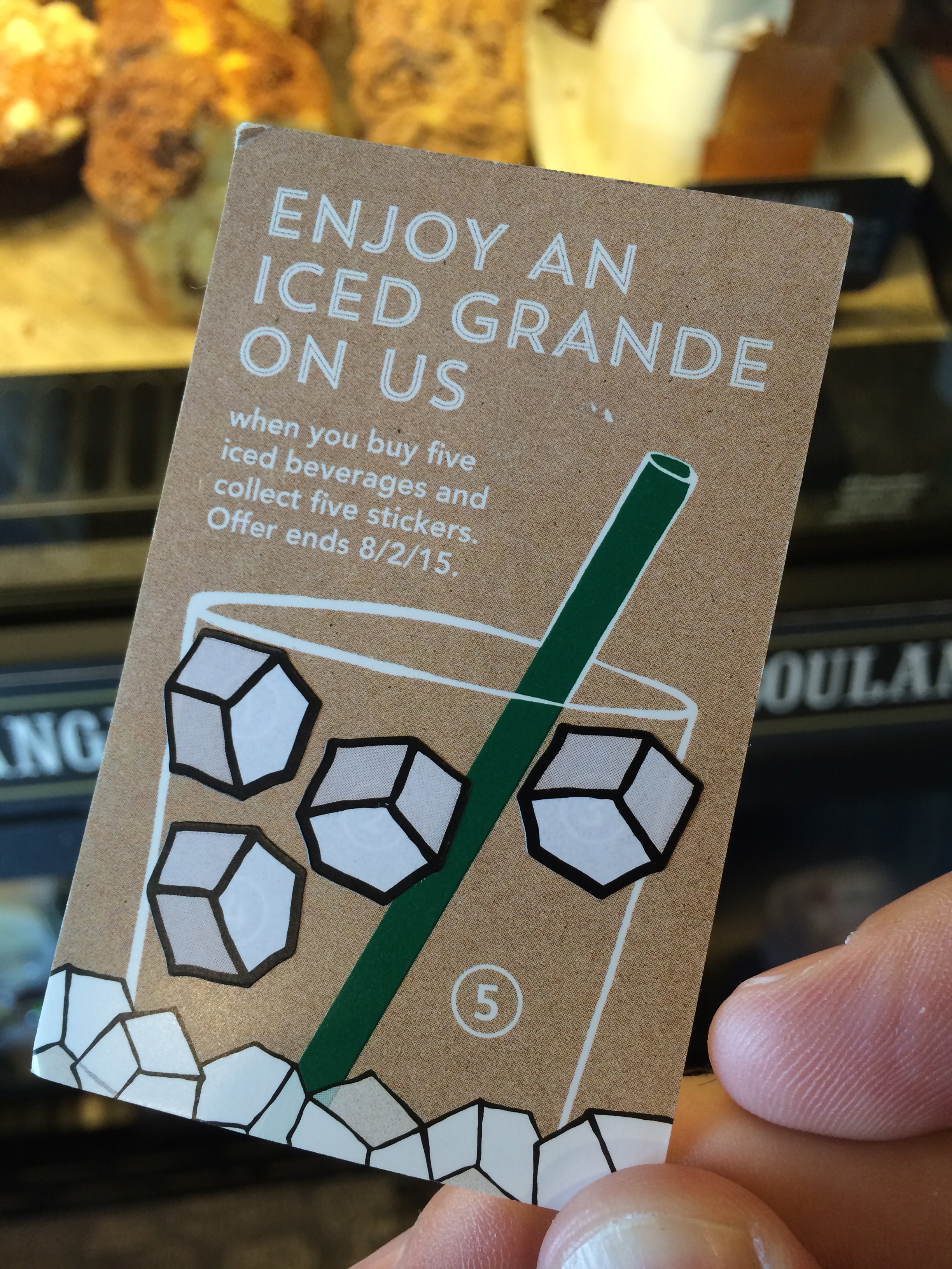
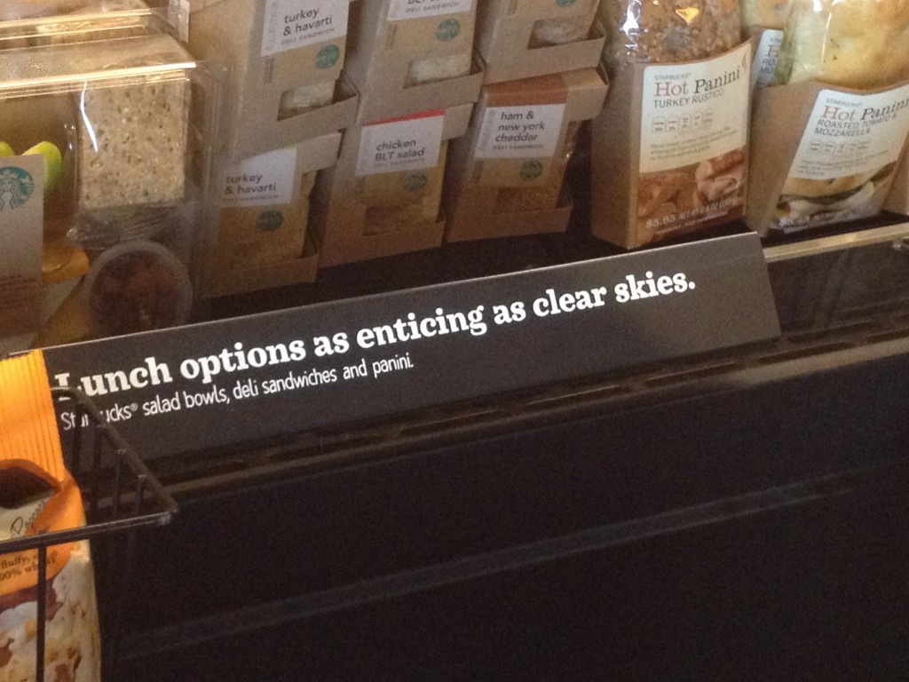
Or this one. This one makes me so mad. I haven’t tried your stupid sandwiches yet so it’s totally impossible to have a favorite.
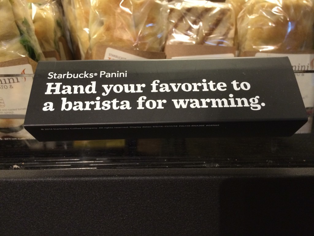
Shut up. Shut up! Just shut. Up. Even if I HAD tried all the paninis and I DID have a favorite WHICH I HAVEN’T AND I DON’T, this is manipulative and airheaded.
It’s airheaded. That’s my main problem. The writing at the coffee shop where I tithe daily is that of an airhead.
The following is an older example from my Selling Eating book (that’s why it’s in black and white—I couldn’t find the original) and the previous two examples are from summer 2015: this has been going on for a long time.
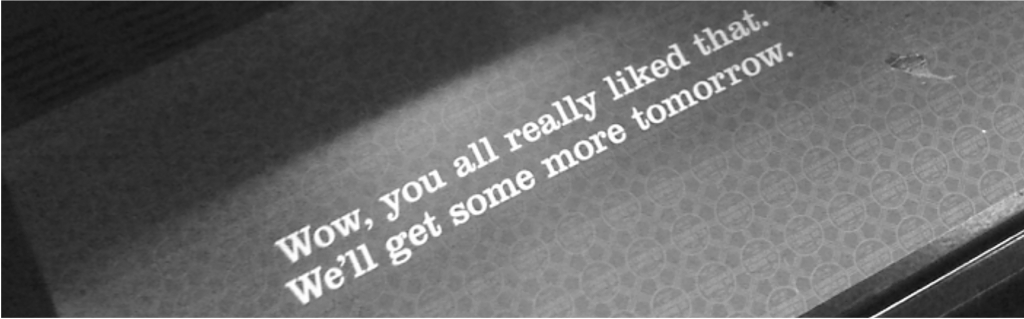
That’s on the paper that lines the case; you only see it when all the food is gone. That’s a clever idea in a tactical sense—having a message with some personality hiding under all the merchandise (I bet the designer suggested it). But doesn’t this line seem needy and ingratiating? I’m not the one who emptied the case. I wasn’t even here. Don’t tell me what I like. Don’t assume I love you, even though I probably do, because it forces me to get grumpy. Dang it, Starbucks.
Awhile back I appreciated your well-intentioned attempt to get me thinking about race relations by publishing a little newspaper and leaving it in piles around the store to get important conversation flowing. I can appreciate your wanting to use your behemoth size for a good cause.

But—it’s the writing. Is it just me, or is there a sort of willfully naïve air hovering over this?
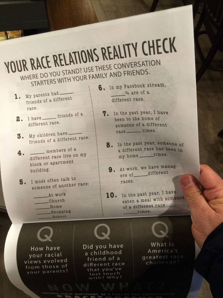
(sigh) It’s probably just me. That’s all legit conversation starter stuff. Still, I’m very sensitive to this goofy, dippy voice because I’ve been paying attention for a long time, and Starbucks’ speaking voice has always been this way. For example, I’ve paid attention over the years to how they write about musicians. It’s so breathless and overly earnest.
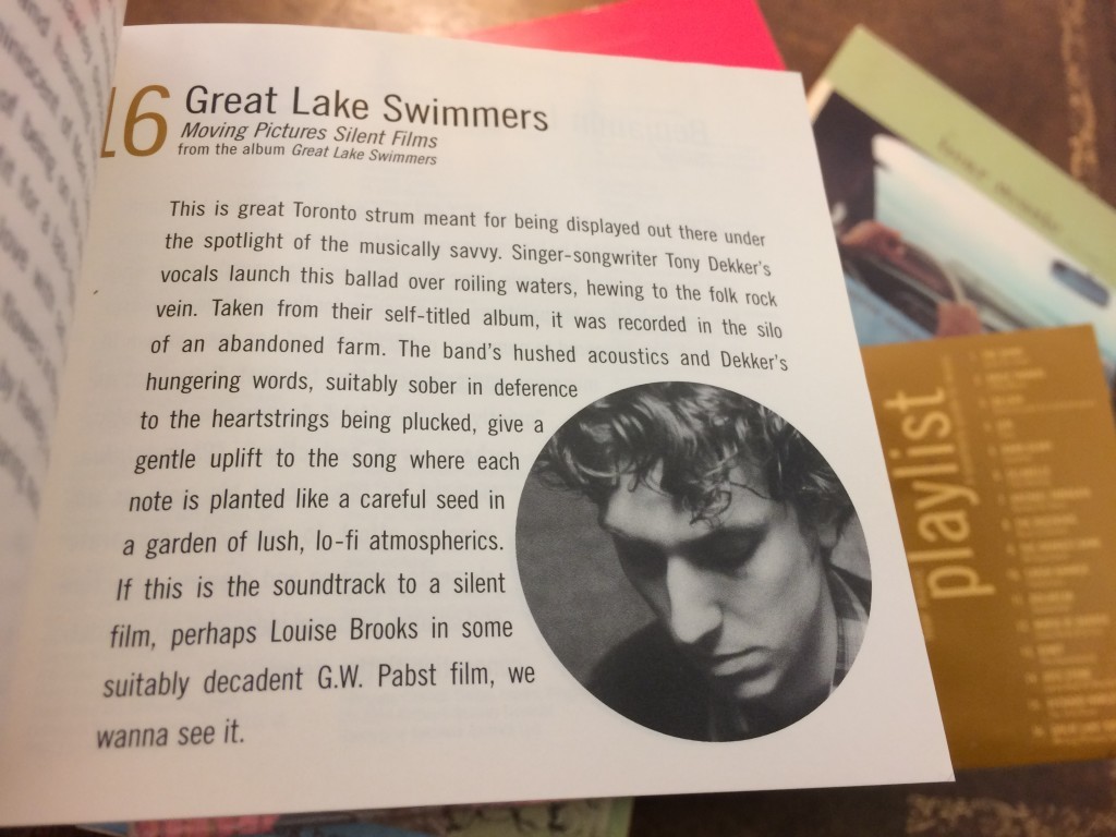
“…each note is planted like a careful seed in a garden of lush, lo-fi atmospherics,” you say?
I know I should just chill out. But I see this stuff every day. I’ve spent so much time in the company of this gushy Starbucks Copywriter.
I just want the whole package: design AND writing. Starbucks has over half the equation—the design (which is the most important, since people judge the brand visually far more than by what they say). I just want the writing to stop being so irritatingly vacuous.
Or what. Or I’ll stop coming! …hahahaha. (sigh) Right. Okay.
I’ll see you tomorrow morning.
Try to contain your enthusiasm.